
Typography design at Amman Design Week explores the connection between old and new and the intersection of Arabic, French, and Berber Amazigh. The Hangar Exhibition presents two specialists in typography; one from Jordan, and the other from Morocco.
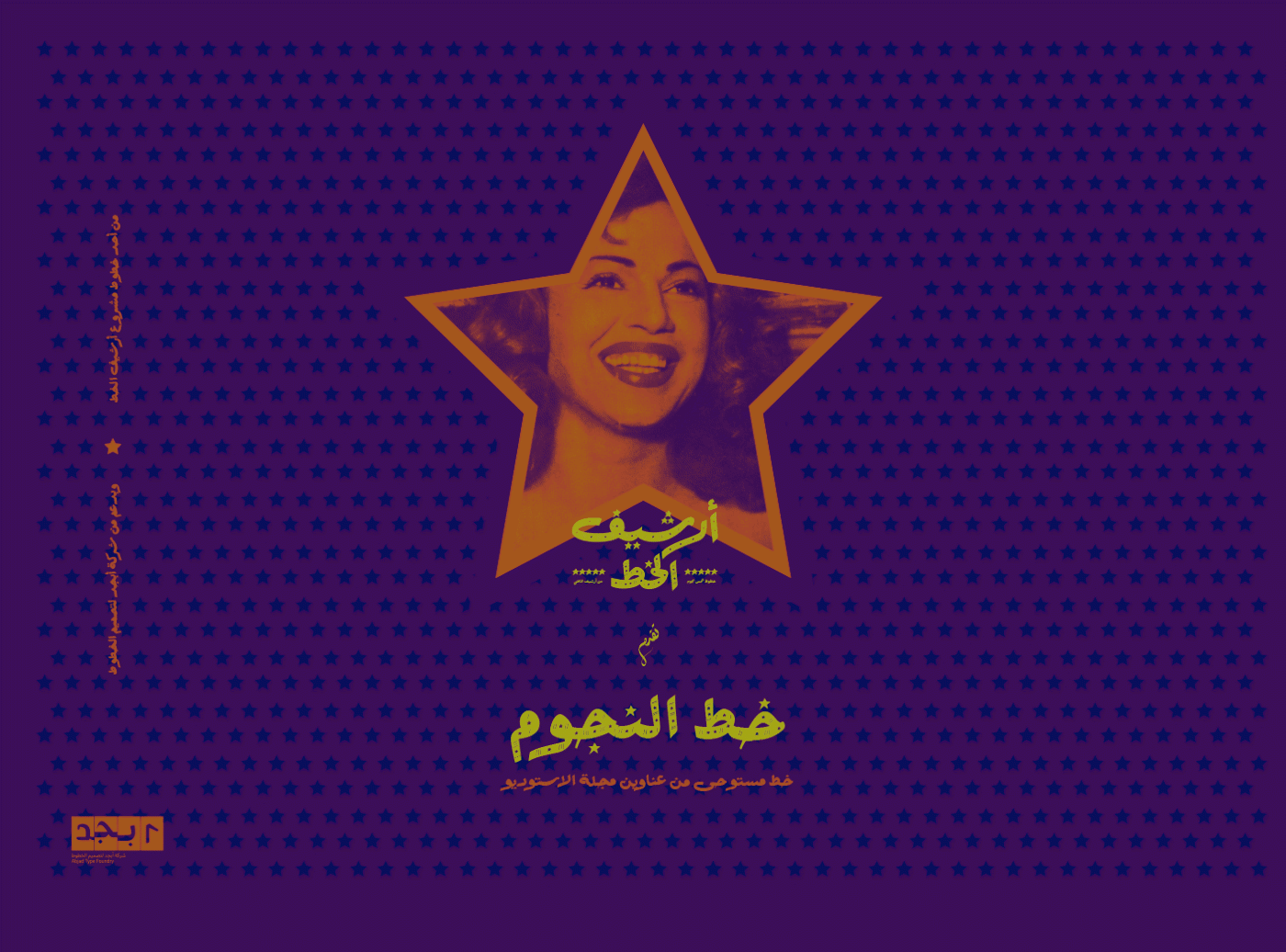
‘Arsheef Alkhatt’ is platform that revives and pays tribute to classical Arabic letterings from different sources and presents them as affordable digital fonts for independent designers. The typefaces are inspired from classical experiments that were created by Arab calligraphers and lettering artists, mostly in the 20th century, for magazines, book covers, movie posters, shop signs, and product covers. The platform was founded as one of the initiatives that are powered by Abjad type foundry.
Ali Almasri is a designer and multidisciplinary artist. His practices encompass experimentation with multiple media, relating in particular to the Arabic culture. In 2014, he launched his own type foundry under the name Abjad. He also co-founded ‘Wajha’, an independent social initiative that uses design and branding knowledge to help the community by offering design services for free. In 2017 he launched several platforms, including Arsheef Alkhatt, and his own pop-up cafe MaqhaX.
IG: @alialmasri
In Morocco, the three official languages are Arabic, French and Berber Amazigh, so the scripts used in the cities signage and in government paperwork are Arabic, Latin and Tifinagh. Chourouk Zarkaoui created the 'Miraate' typeface for these different scripts to mirror one another and to encourage a coexistence of culture.
Each of the scripts – Arabic, Tifinagh and Latin – draws their characteristics from their own different peculiarities to create a certain homogeneity in a visual form.

The letterforms within the 2017 typeface "oneseven.km" , designed along with designer Alex Fergusson, express simplicity contrasted with complexity. Its characters are simple in their form, yet are derived from a complex grid influenced by Islamic ornamentation. Its typographic concept relates to the movement and connectivity between two major scripts, Arabic and Latin. The scripts are joined through both ascendent and descendent diphthongs to allow written texts to alternate between both scripts as a singular composition. The assigned title, oneseven.km, is a commentary on the distance between earth and sky, and relates to the connections made between both scripts when formed as a 'mashrabiya', a window covering found in traditional Islamic architecture.

Chourouk Zarkaoui is a Moroccan type designer and artist. Her work addresses biopower and marginality. Her practice focuses on the study of language, words and their components. Her typeface, Miraate (meaning 'mirror' in Arabic) tries to bridge the gap between three different cultures, languages and scripts.


